Inspired from Arthur Charpentier’s blog post here are some codes to create beautiful statistical tables using R and export them to use in latex.
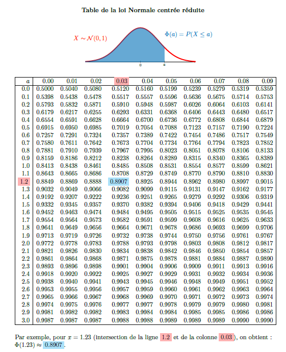
Normal distribution table
First tables show the values of \(\Phi\), which are the values of the cumulative distribution function of the normal distribution.
1
2
3
4
5
6
u=seq(0,3.09,by=0.01)
p=pnorm(u)
m=matrix(p,ncol=10,byrow=TRUE)
options(digits=4)
rownames(m)=seq(0,3,b=.1)
colnames(m)=seq(0,.09,by=.01)
Then to export it into latex format:
1
2
3
library(xtable)
newm=xtable(m,digits=4)
print.xtable(newm, type="latex", file="nor1.tex")
The result of the tex file is the following:
% latex table generated in R 3.4.1 by xtable 1.8-2 package
% Thu Nov 30 15:10:28 2017
\begin{table}[ht]
\centering
\begin{tabular}{rrrrrrrrrrr}
  \hline
 & 0 & 0.01 & 0.02 & 0.03 & 0.04 & 0.05 & 0.06 & 0.07 & 0.08 & 0.09 \\
  \hline
0 & 0.5000 & 0.5040 & 0.5080 & 0.5120 & 0.5160 & 0.5199 & 0.5239 & 0.5279 & 0.5319 & 0.5359 \\
  0.1 & 0.5398 & 0.5438 & 0.5478 & 0.5517 & 0.5557 & 0.5596 & 0.5636 & 0.5675 & 0.5714 & 0.5753 \\
  0.2 & 0.5793 & 0.5832 & 0.5871 & 0.5910 & 0.5948 & 0.5987 & 0.6026 & 0.6064 & 0.6103 & 0.6141 \\
  0.3 & 0.6179 & 0.6217 & 0.6255 & 0.6293 & 0.6331 & 0.6368 & 0.6406 & 0.6443 & 0.6480 & 0.6517 \\
  0.4 & 0.6554 & 0.6591 & 0.6628 & 0.6664 & 0.6700 & 0.6736 & 0.6772 & 0.6808 & 0.6844 & 0.6879 \\
  0.5 & 0.6915 & 0.6950 & 0.6985 & 0.7019 & 0.7054 & 0.7088 & 0.7123 & 0.7157 & 0.7190 & 0.7224 \\
  0.6 & 0.7257 & 0.7291 & 0.7324 & 0.7357 & 0.7389 & 0.7422 & 0.7454 & 0.7486 & 0.7517 & 0.7549 \\
  0.7 & 0.7580 & 0.7611 & 0.7642 & 0.7673 & 0.7704 & 0.7734 & 0.7764 & 0.7794 & 0.7823 & 0.7852 \\
  0.8 & 0.7881 & 0.7910 & 0.7939 & 0.7967 & 0.7995 & 0.8023 & 0.8051 & 0.8078 & 0.8106 & 0.8133 \\
  0.9 & 0.8159 & 0.8186 & 0.8212 & 0.8238 & 0.8264 & 0.8289 & 0.8315 & 0.8340 & 0.8365 & 0.8389 \\
  1 & 0.8413 & 0.8438 & 0.8461 & 0.8485 & 0.8508 & 0.8531 & 0.8554 & 0.8577 & 0.8599 & 0.8621 \\
  1.1 & 0.8643 & 0.8665 & 0.8686 & 0.8708 & 0.8729 & 0.8749 & 0.8770 & 0.8790 & 0.8810 & 0.8830 \\
  1.2 & 0.8849 & 0.8869 & 0.8888 & 0.8907 & 0.8925 & 0.8944 & 0.8962 & 0.8980 & 0.8997 & 0.9015 \\
  1.3 & 0.9032 & 0.9049 & 0.9066 & 0.9082 & 0.9099 & 0.9115 & 0.9131 & 0.9147 & 0.9162 & 0.9177 \\
  1.4 & 0.9192 & 0.9207 & 0.9222 & 0.9236 & 0.9251 & 0.9265 & 0.9279 & 0.9292 & 0.9306 & 0.9319 \\
  1.5 & 0.9332 & 0.9345 & 0.9357 & 0.9370 & 0.9382 & 0.9394 & 0.9406 & 0.9418 & 0.9429 & 0.9441 \\
  1.6 & 0.9452 & 0.9463 & 0.9474 & 0.9484 & 0.9495 & 0.9505 & 0.9515 & 0.9525 & 0.9535 & 0.9545 \\
  1.7 & 0.9554 & 0.9564 & 0.9573 & 0.9582 & 0.9591 & 0.9599 & 0.9608 & 0.9616 & 0.9625 & 0.9633 \\
  1.8 & 0.9641 & 0.9649 & 0.9656 & 0.9664 & 0.9671 & 0.9678 & 0.9686 & 0.9693 & 0.9699 & 0.9706 \\
  1.9 & 0.9713 & 0.9719 & 0.9726 & 0.9732 & 0.9738 & 0.9744 & 0.9750 & 0.9756 & 0.9761 & 0.9767 \\
  2 & 0.9772 & 0.9778 & 0.9783 & 0.9788 & 0.9793 & 0.9798 & 0.9803 & 0.9808 & 0.9812 & 0.9817 \\
  2.1 & 0.9821 & 0.9826 & 0.9830 & 0.9834 & 0.9838 & 0.9842 & 0.9846 & 0.9850 & 0.9854 & 0.9857 \\
  2.2 & 0.9861 & 0.9864 & 0.9868 & 0.9871 & 0.9875 & 0.9878 & 0.9881 & 0.9884 & 0.9887 & 0.9890 \\
  2.3 & 0.9893 & 0.9896 & 0.9898 & 0.9901 & 0.9904 & 0.9906 & 0.9909 & 0.9911 & 0.9913 & 0.9916 \\
  2.4 & 0.9918 & 0.9920 & 0.9922 & 0.9925 & 0.9927 & 0.9929 & 0.9931 & 0.9932 & 0.9934 & 0.9936 \\
  2.5 & 0.9938 & 0.9940 & 0.9941 & 0.9943 & 0.9945 & 0.9946 & 0.9948 & 0.9949 & 0.9951 & 0.9952 \\
  2.6 & 0.9953 & 0.9955 & 0.9956 & 0.9957 & 0.9959 & 0.9960 & 0.9961 & 0.9962 & 0.9963 & 0.9964 \\
  2.7 & 0.9965 & 0.9966 & 0.9967 & 0.9968 & 0.9969 & 0.9970 & 0.9971 & 0.9972 & 0.9973 & 0.9974 \\
  2.8 & 0.9974 & 0.9975 & 0.9976 & 0.9977 & 0.9977 & 0.9978 & 0.9979 & 0.9979 & 0.9980 & 0.9981 \\
  2.9 & 0.9981 & 0.9982 & 0.9982 & 0.9983 & 0.9984 & 0.9984 & 0.9985 & 0.9985 & 0.9986 & 0.9986 \\
  3 & 0.9987 & 0.9987 & 0.9987 & 0.9988 & 0.9988 & 0.9989 & 0.9989 & 0.9989 & 0.9990 & 0.9990 \\
   \hline
\end{tabular}
\end{table}
I did some modifications to get a better table, and I created using tikz a figure to explain what the table is showing. The code of the figure is the following:
1
2
3
4
5
6
7
8
9
10
11
12
13
14
15
16
17
18
19
20
21
22
23
24
25
26
27
28
29
30
31
32
33
34
35
36
\begin{figure}[!h]
\centering
\begin{tikzpicture}[scale=0.6]

\def \xMoy{0};%moyenne

\def \ecartType {1};%ecart-type


\begin{axis}
[
axis x line=bottom,
axis y line=none,
xmin=-3,
xmax=3,
ymin=0,
ymax=0.5,
xtick={0,1.3},
xticklabels={0,$a$},
enlarge x limits=-1, %hack to plot on the full x-axis scale

width=13cm, %set bigger width

height=6cm,
]

\addplot+[mark=none,domain=-3:3,samples=200,color=red,smooth,line width=1mm]{(exp(-(x-\xMoy)^2/(2*\ecartType^2)))/(\ecartType*sqrt(6.28))};


\addplot+[mark=none,fill=NavyBlue,draw=NavyBlue,opacity=0.6,domain=-25:1.3,samples=150]{(exp(-(x-\xMoy)^2/(2*\ecartType^2)))/(\ecartType*sqrt(6.28))}\closedcycle;

\end{axis}

\draw (8,2.8) node[right] { {\color{NavyBlue} $\Phi(a)=P(X\le a)$}};
\draw (2.5,2.4) node[left] { {\color{red} $X  \thicksim \mathcal{N}(0,1)$}};

\end{tikzpicture}
\end{figure}
Here is a screen capture of the generated table
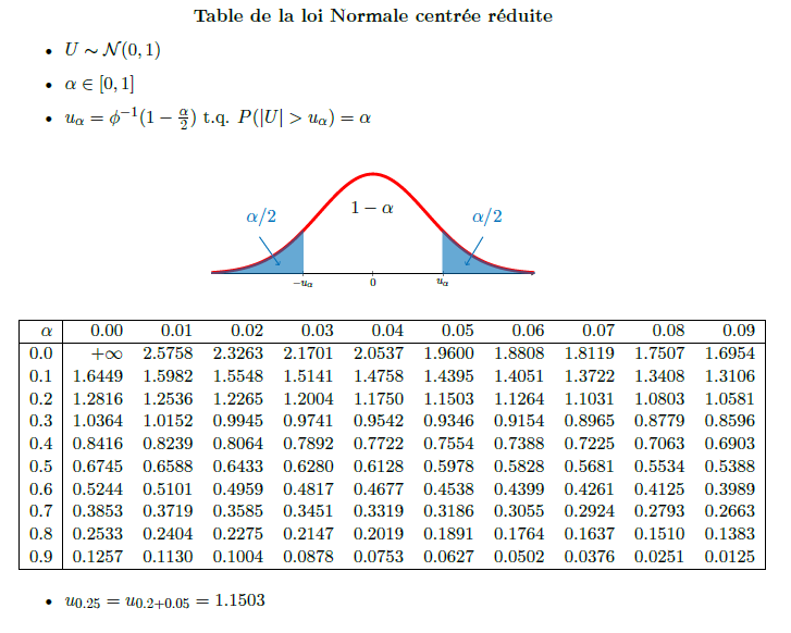
Another Normal distribution table
This table gives \(u_{\alpha}\) with respect to the value of \(\alpha\).
1
2
3
4
5
6
7
8
9
u=seq(0,0.99,by=0.01)
p=qnorm(1-u/2)
m=matrix(p,ncol=10,byrow=TRUE)
options(digits=4)
rownames(m)=seq(0,0.9,b=.1)
colnames(m)=seq(0,.09,by=.01)
# library(xtable)

newm=xtable(m,digits=4)
print.xtable(newm, type="latex", file="nor2.tex")
Here is the result from the generated pdf, including the figure explaining what the table shows
The latex code to create the figure is
1
2
3
4
5
6
7
8
9
10
11
12
13
14
15
16
17
18
19
20
21
22
23
24
25
26
27
28
29
30
31
32
33
34
35
36
37
38
39
40
41
42
\begin{figure}[!h]
\centering
\begin{tikzpicture}[scale=0.6]

\def \xMoy{0};%moyenne

\def \ecartType {1};%ecart-type


\begin{axis}
[
axis x line=bottom,
axis y line=none,
xmin=-3,
xmax=3,
ymin=0,
ymax=0.5,
xtick={-1.3,0,1.3},
xticklabels={$-u_{\alpha}$,0,$u_{\alpha}$},
enlarge x limits=-1, %hack to plot on the full x-axis scale

width=13cm, %set bigger width

height=6cm,
]

\addplot+[mark=none,domain=-3:3,samples=200,color=red,smooth,line width=1mm]{(exp(-(x-\xMoy)^2/(2*\ecartType^2)))/(\ecartType*sqrt(6.28))};


\addplot+[mark=none,fill=NavyBlue,draw=NavyBlue,opacity=0.6,domain=-25:-1.3,samples=150]{(exp(-(x-\xMoy)^2/(2*\ecartType^2)))/(\ecartType*sqrt(6.28))}\closedcycle;

\addplot+[mark=none,fill=NavyBlue,draw=NavyBlue,opacity=0.6,domain=1.3:25,samples=150]{(exp(-(x-\xMoy)^2/(2*\ecartType^2)))/(\ecartType*sqrt(6.28))}\closedcycle;

\end{axis}

\draw (9,2) node[right] { {\color{NavyBlue} $\alpha/2$}};
\draw (1,2) node[right] { {\color{NavyBlue} $\alpha/2$}};
% \draw (2.5,2.4) node[left] { {\color{red} $X  \thicksim \mathcal{N}(0,1)$}};

\draw (4.7,2.3) node[right] { {\color{black} $1-\alpha$}};

\draw [->, draw=NavyBlue] (9.6,1.3) -> (9,0.3);
\draw [->, draw=NavyBlue] (1.7,1.3) -> (2.4,0.3);

\end{tikzpicture}
\end{figure}
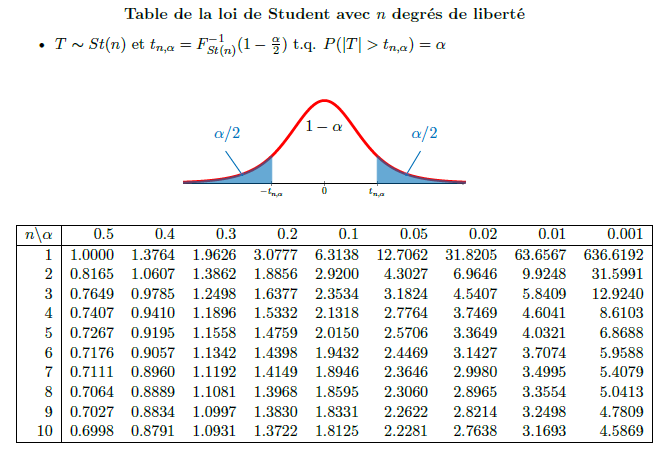
Student table
The R code:
1
2
3
4
5
6
7
8
9
10
11
12
13
14
15
16
n=seq(1,10,by=1)
alpha = c(0.5,0.4,0.3,0.2,0.1,0.05,0.02,0.01,0.001)
mt=matrix(0,nrow=10,ncol=9,byrow=TRUE)

for(i in 1:length(n))
{ for(j in 1:length(alpha)){
  mt[i,j] = c(qt(1-alpha[j]/2,n[i]))
}}


options(digits=4)
rownames(mt)=seq(1,10,by=1)
colnames(mt)=alpha
library(xtable)
mt2=xtable(m,digits=4)
print.xtable(mt2, type="latex", file="student.tex")
The screen capture of the generated table from the pdf file
And here is the latex code for the figure of the student distribution
1
2
3
4
5
6
7
8
9
10
11
12
13
14
15
16
17
18
19
20
21
22
23
24
25
26
27
28
29
30
31
32
33
34
\begin{figure}[!h]
\centering
\begin{tikzpicture}[scale=0.5]

\def \xMoy{0};%moyenne

\def \ecartType {1};%ecart-type


\begin{axis}
[
axis x line=bottom,
axis y line=none,
xmin=-3,
xmax=3,
ymin=0,
ymax=0.5,
xtick={0,1.3},
xticklabels={0,$a$},
enlarge x limits=-1, %hack to plot on the full x-axis scale

width=13cm, %set bigger width

height=6cm,
]

\addplot+[mark=none,domain=-3:3,samples=200,color=red,smooth,line width=1mm]{(exp(-(x-\xMoy)^2/(2*\ecartType^2)))/(\ecartType*sqrt(6.28))};


\addplot+[mark=none,fill=NavyBlue,draw=NavyBlue,opacity=0.6,domain=-25:1.3,samples=150]{(exp(-(x-\xMoy)^2/(2*\ecartType^2)))/(\ecartType*sqrt(6.28))}\closedcycle;

\end{axis}

\draw (8,2.8) node[right] { {\color{NavyBlue} $\Phi(a)=P(X\le a)$}};
\draw (2.5,2.4) node[left] { {\color{red} $X  \thicksim \mathcal{N}(0,1)$}};

\end{tikzpicture}
\end{figure}